What's a project?
Skyeng.ru has a form for collecting customer information. After completing this form, the customer is redirected to the page with a showcase for payment and product demonstration. Payment is required on this page before a manager can call the customer. The first payment is the most important metric for onboarding, which is why our team conducts many experiments, especially with the showcase and payment process.
Issues
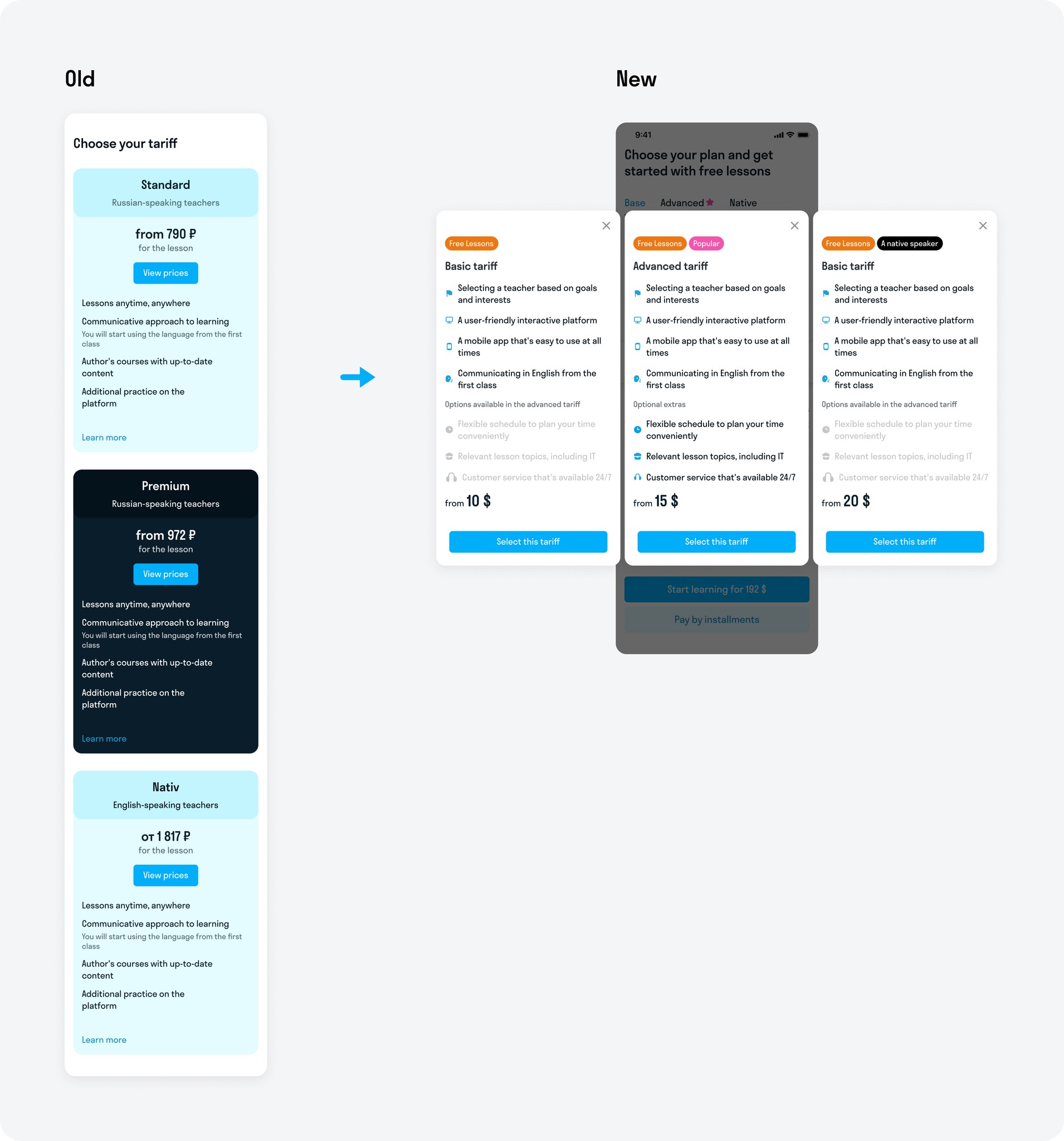
・ Tariff comparisons are forming too long a flow to the storefront
・ The tariffs are not responsive to mobile - really long text view
・ Horizontal scrolling is not obvious
・ There are too many numbers and packages in the showcase - defocus
・ Storefront tabs are not obvious
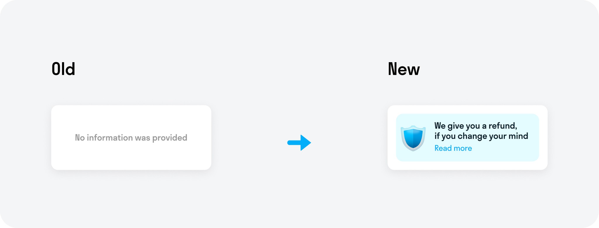
・ No refund information
Presentation of the old design issues by video
Main hypothesis
Designing the mobile web to align with users’ mobile patterns of behavior can help increase sales metrics.
Why was such a hypothesis made? Our website was initially created with a desktop-first approach, which is fundamentally flawed because more than 70% of our users access it through mobile devices.
To address this, I have decided to apply mobile patterns of behavior based on Human Interface Guidelines and Material Design principles.
Research
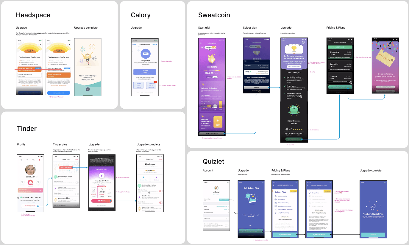
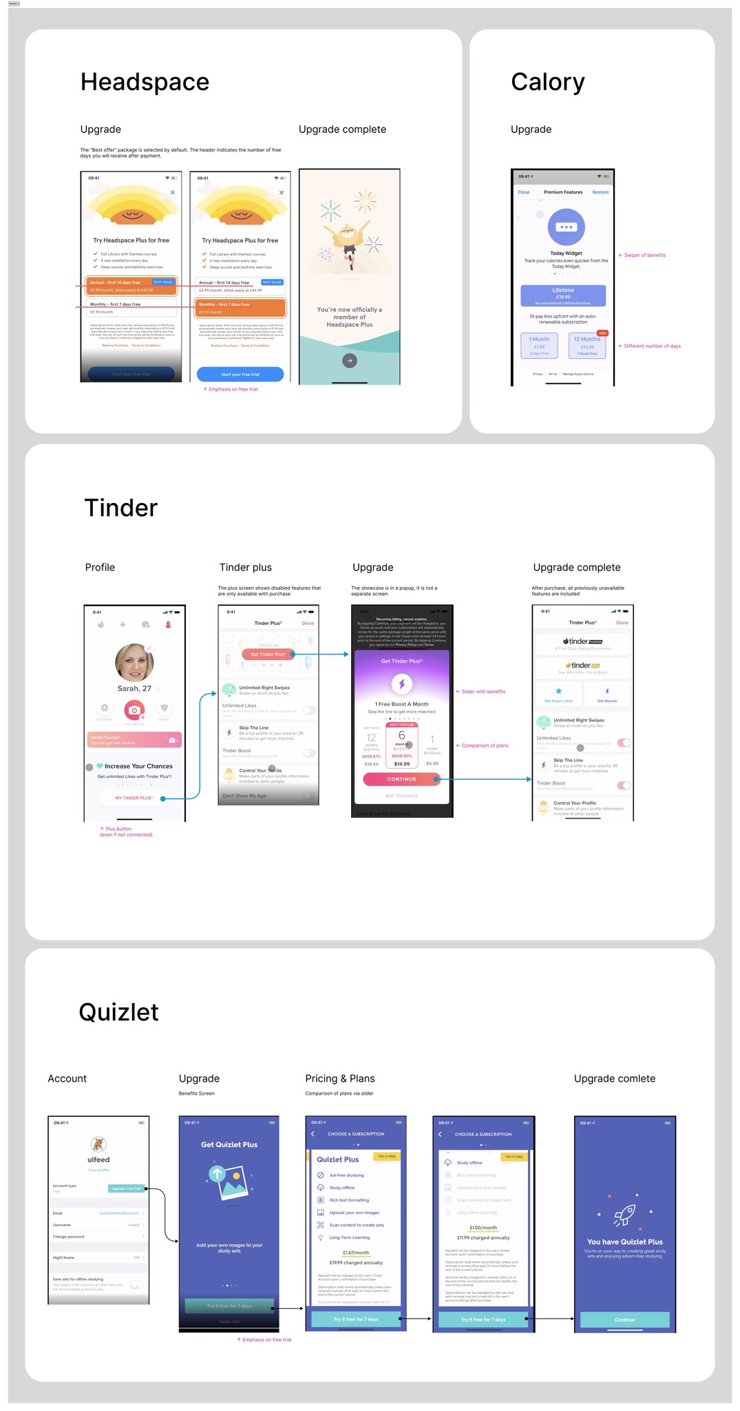
Benchmark
I analyzed many apps that have payment processes and ways to handle client objections before payment. I noted some ideas on how apps describe their product before payment:
・ Explain the benefits of subscriptions
・ Make a personal offer based on a survey
・ Offer a discount for immediate payment
・ Begin by presenting the most profitable package (the most expensive one)
・ Provide a tariff comparison as an additional feature.
UX test
I created the first prototype and conducted an unmoderated UX test with users. I asked them about their expectations and impressions. The following are examples of questions for the UX test:
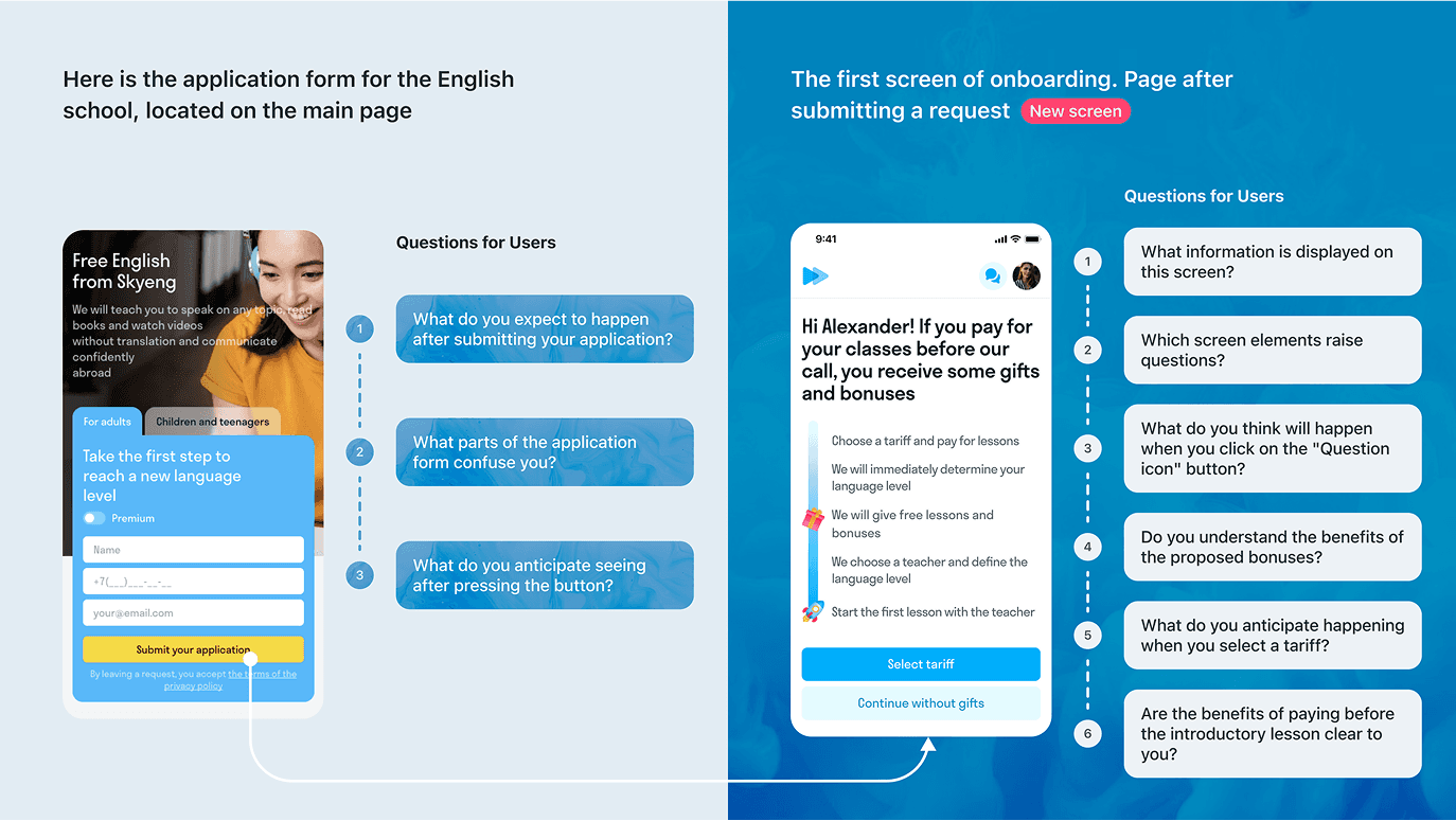
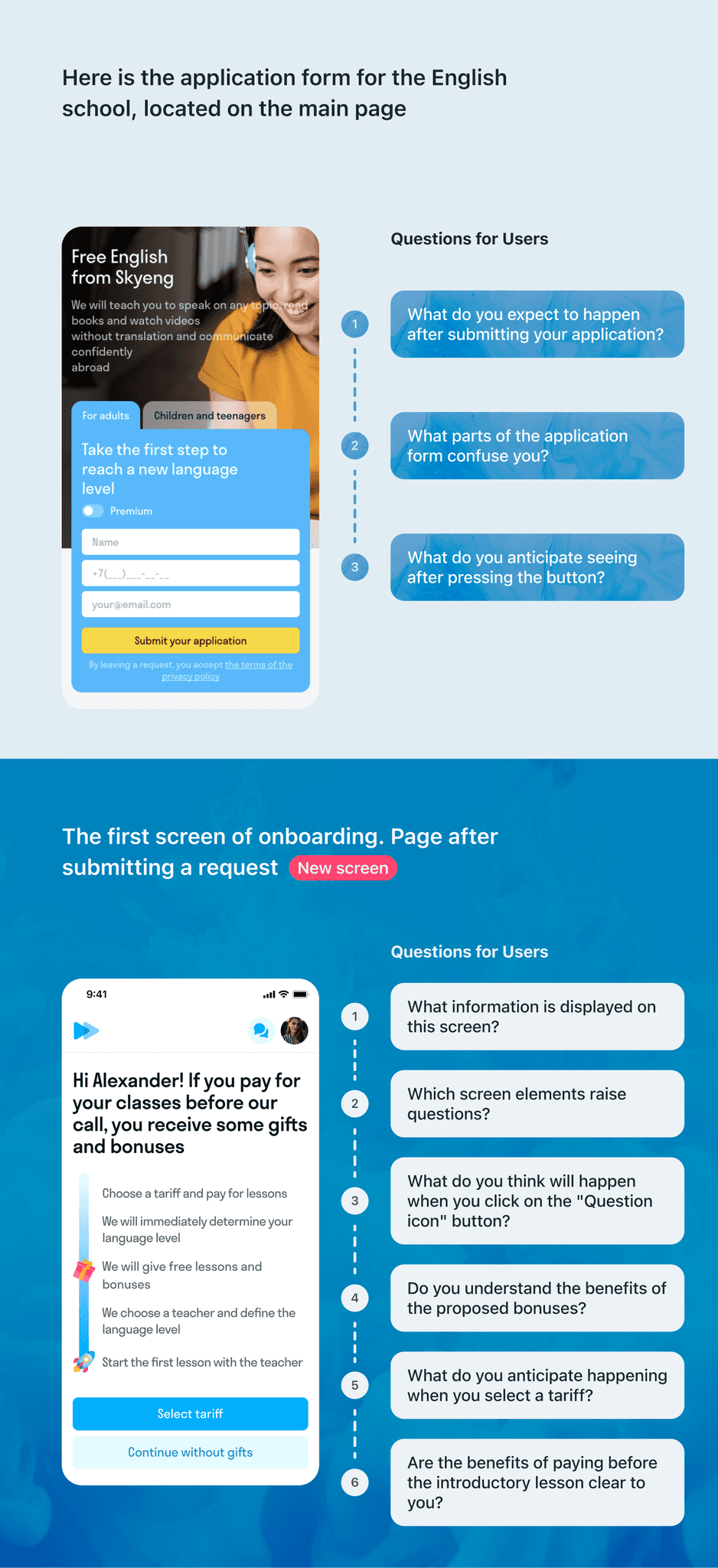
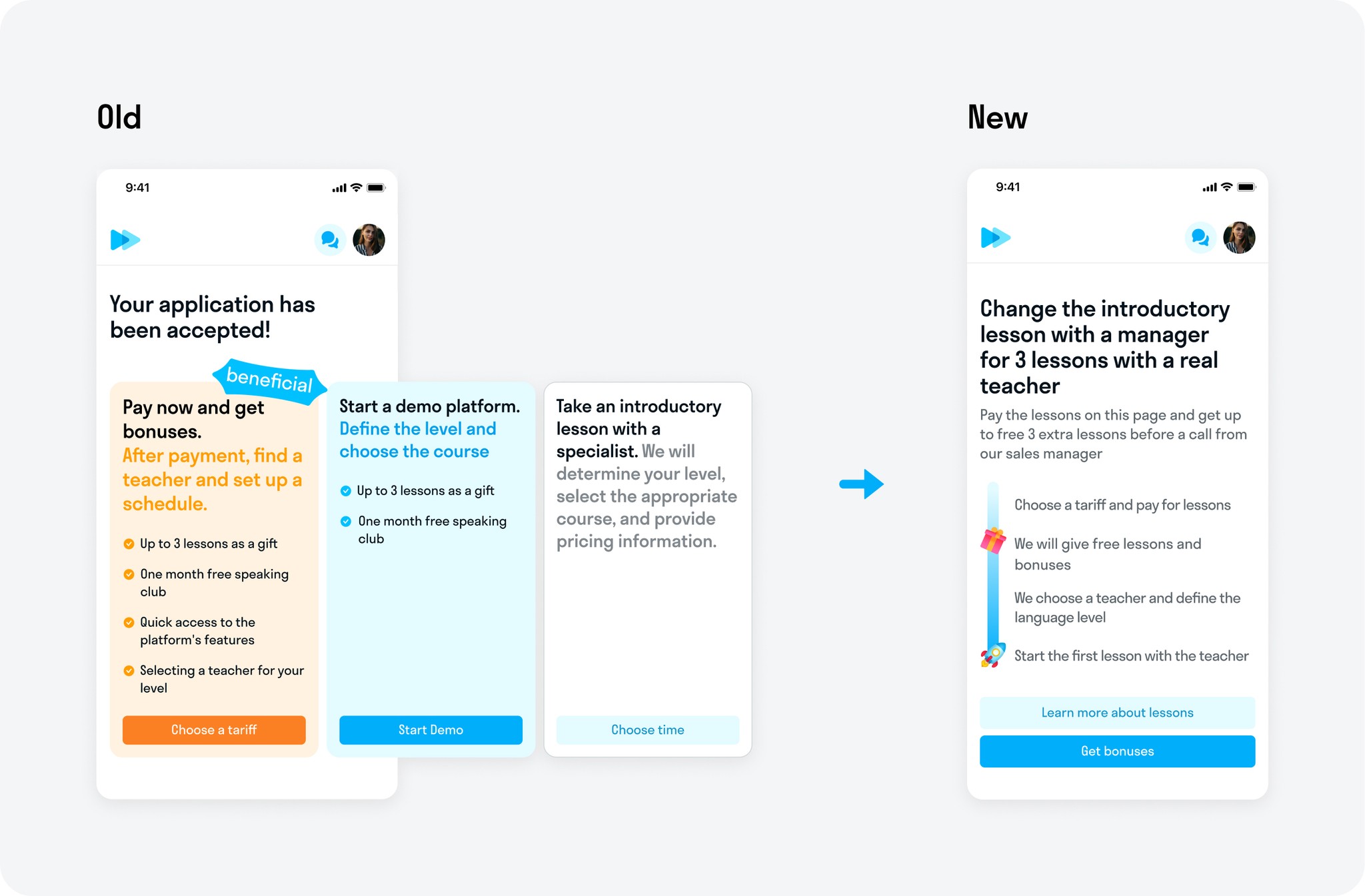
This UX test revealed that our customers expect a call from the manager and information about the success of their application. However, when users see the first onboarding screen about gifts and bonuses, they understand that they will only receive gifts upon making a payment at that moment.
Based on the outcomes of the UX test, I was sure the results were positive. Therefore, I could begin designing and preparing layouts for development.
Design process
After redesigning the user journey and improving information presentation, storefront visibility significantly increased. Previously, 95% of users didn’t even reach it due to an inconvenient layout. Now, 40% of users not only see the storefront but also interact with it, leading to higher engagement and improved key metrics.
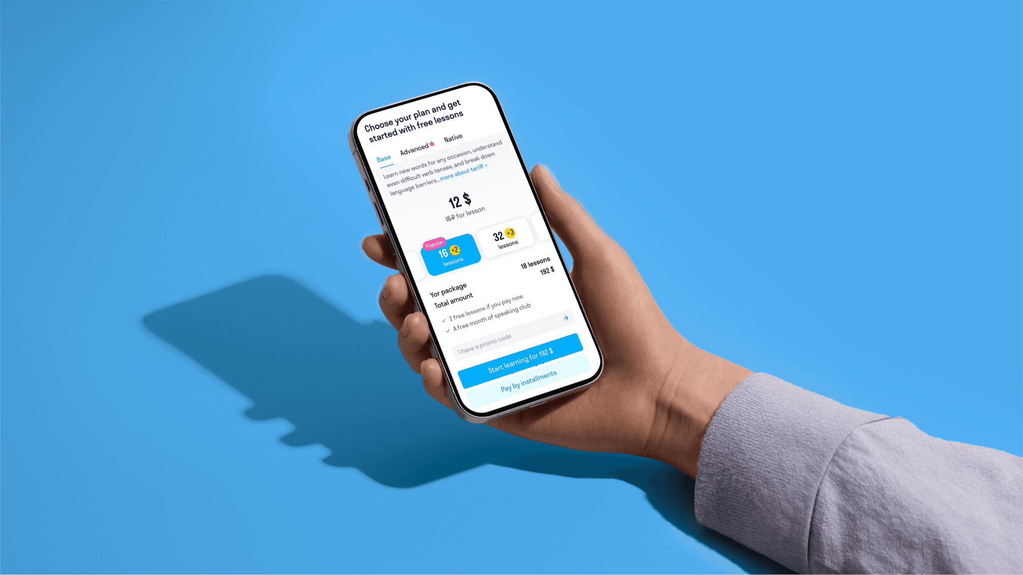
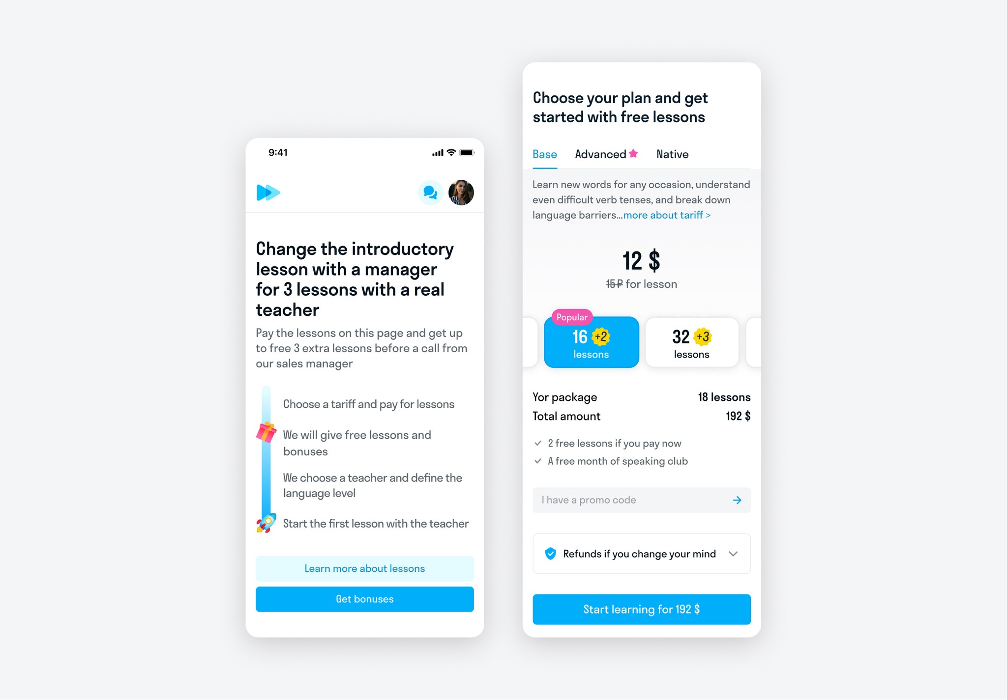
The first screen
Instead of a banner carousel, the user is presented with a single offer. This solves the problem of distraction and highlights the call to action.
Return Warranty
A banner about the return guarantee has been added.
Showcase
Instead of multiple numbers and buttons, now there is only one price and one clear call to action. Dynamic information about gifts and bonuses has been added. When choosing a particular package, all information changes to current.
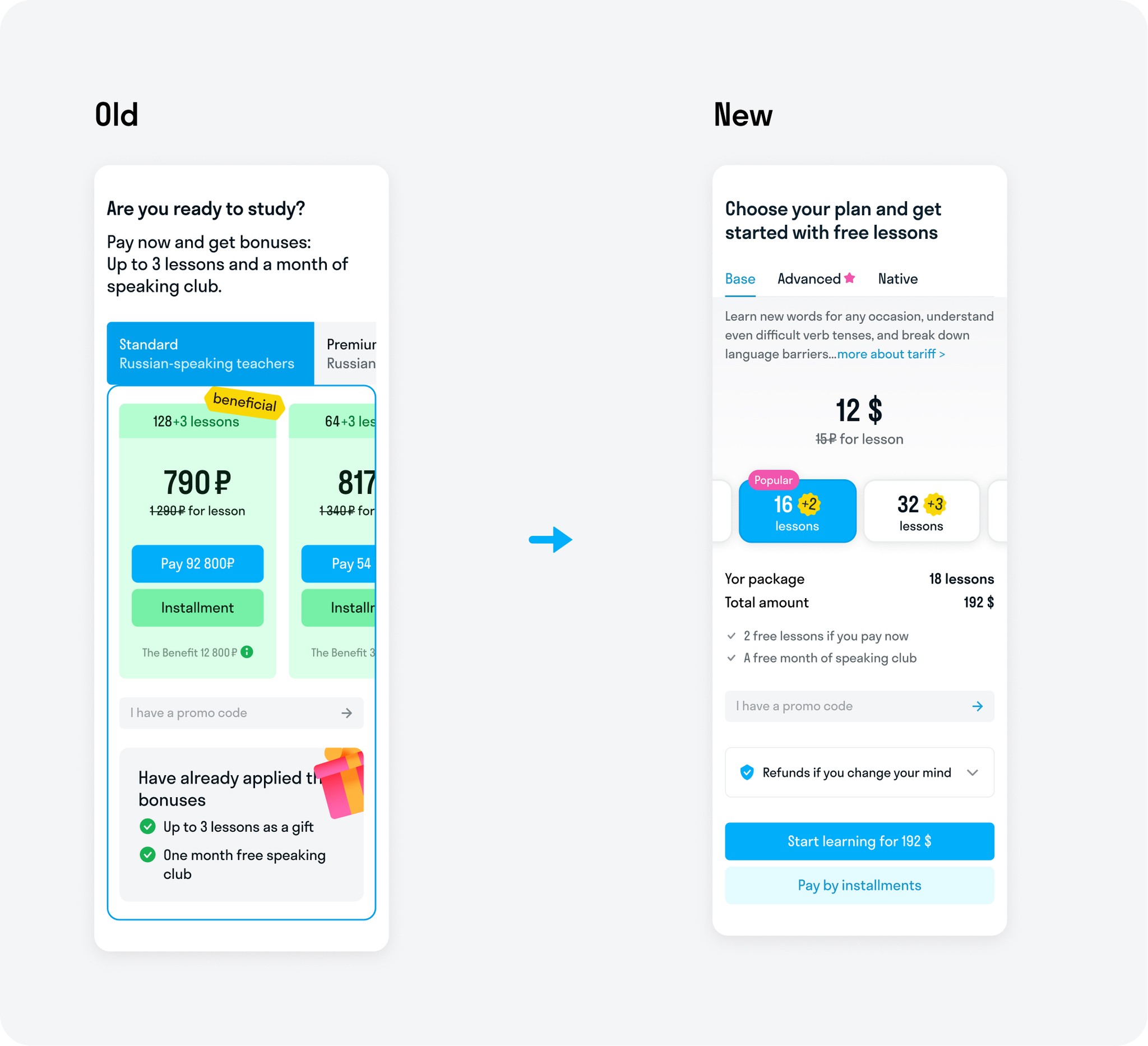
Tariff comparison
The tariff comparison was moved to a modal box so that the user could focus on selecting a tariff. Horizontal scrolling allows for a convenient comparison of tariffs.
Result
Visual simplification and shortening of the user's way to the payment has significantly increased key metrics by an average of 15%:
・ Onboarding → Storefront
・ Click on the "Buy" button
・ Payment
These changes also have a positive impact on overall payment metrics, with an average increase of 2x in all payments.
Anna' Portfolio
anna.levidesigner@gmail.com